Digital Report Teaser
Redesigning Labor Sync for Trade Workers
Client
Labor Sync
Project Duration
3 months
My Role
UX Design
Interaction Design
UI Design
Programs Used
Figma
Google Docs
Notablility App
Trade workers often move between various job sites, with each site presenting unique challenges for accurately logging their work hours. The current methods, such as paper timesheets and single-access punch-in machines, lead to delays, inaccuracies, and cumbersome adjustment processes, affecting workers' pay and efficiency.
Key Challenges:
Frequent movement between job sites
Inconsistent reporting station locations
Single-access reporting stations/punch-in machines causing delays
Lengthy adjustment processes impacting paychecks
The Problem
My Role
As the sole UX/UI designer, I was responsible for conducting user research, developing personas, ideating solutions, creating wireframes and prototypes, and leading user testing sessions. I collaborated closely with developers, product managers, and the trade workers themselves to ensure the solution met the business goals and user needs.
The Solution
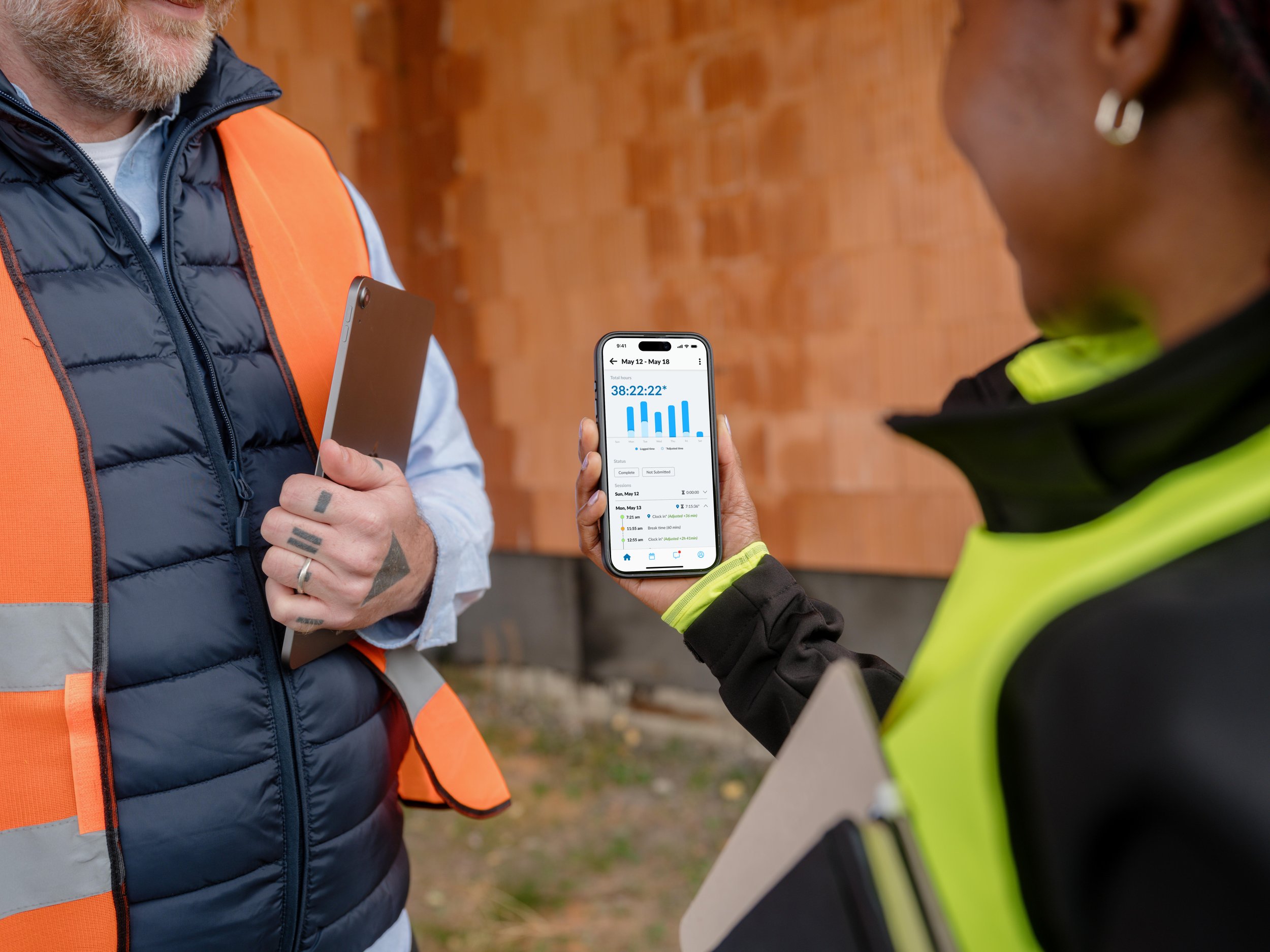
Labor Sync, a mobile app, streamlines time tracking for trade workers. It enables them to clock in and out directly from their devices, submit timesheets promptly, and use geofencing for automatic attendance logging when entering or leaving job sites.
The app consolidates essential features such as timesheet management, job details, crew information, activity feeds, and messaging, providing a comprehensive tool for daily work management.
Research &
Discovery
I began by researching the client and their existing product. Labor Sync, a B2B SaaS startup in Dumont, NJ, was founded in 2011. Their core app allows workers to clock in and out, define travel time, and attribute time to different job tasks throughout their workday. The app is priced at $10 per active worker per month.
Target Audience: Small businesses and trade workers, including general contractors, roofers, plumbers, gardeners, and electricians, who frequently visit different job sites daily.
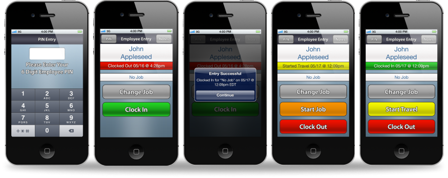
Original Labor Sync app.
While the large buttons were easy to use, workers found it challenging to navigate through the options for updating job details.
Initial App Findings:
The existing app had a confusing interface.
Lacks visibility into timesheets and job-related data.
Trade workers needed clearer and more efficient time tracking processes.
Concerns over manual versus GPS-based logging and the complexity of time adjustments.
Insights from Research:
Timesheets and punch-in machines are not always in designated locations.
Trade workers often wait in line to use punch-in machines or find their timecards, leading to inaccurate reporting times and potential loss of wages.
Competitive analysis of products like Workyard and ClockShark highlighted different user flows and pricing structures. Labor Sync's simplicity and competitive pricing are strengths, but user experience and feature depth need improvement.
From these insights, I created user personas and user journeys to identify areas for improvement.
Persona of a traditional trade worker and their user journey using the original Labor Sync app.
While mapping the time tracking process, I was able to also identify opportunities around improving the initial onboarding and login flows.
Design Process
To address the identified issues, I brainstormed key features focusing on:
Intuitive status changes
Detailed timesheet views
Streamlined submission processes
GPS/geofencing enhancements for automated clock-ins/outs
Integrated messaging
Ideation & Brainstorming
I developed sketches and low-fidelity wireframes to conceptualize the redesigned onboarding flow and feature integration. Using a cohesive design system in Figma, I created clickable prototypes to ensure visual consistency and user-centric functionality.
Wireframing & Prototyping
Wireframes created in Notability app. Part of the focus was to explore changes to the onboarding flow, which gives control back to the worker. Additionally, explored an overview that the workers would care about, while also giving them the option to report to work quickly with a Spotify-inspired progress bar.
User testing sessions validated the intuitive flow and received positive feedback on information accessibility.
Feedback included:
More detailed reporting on adjustments
Clear differentiation between GPS and manual entries
These suggestions were incorporated into iterations that followed.
Testing & Iterations
Final Result &
Metrics
The redesigned Labor Sync app prioritizes simplicity and functionality, reducing user friction and enhancing productivity.
Success metrics were defined in order to anticipate and plan for future iterations, including:
Session completion rates
Timesheet submission frequencies
User satisfaction scores from NPS surveys
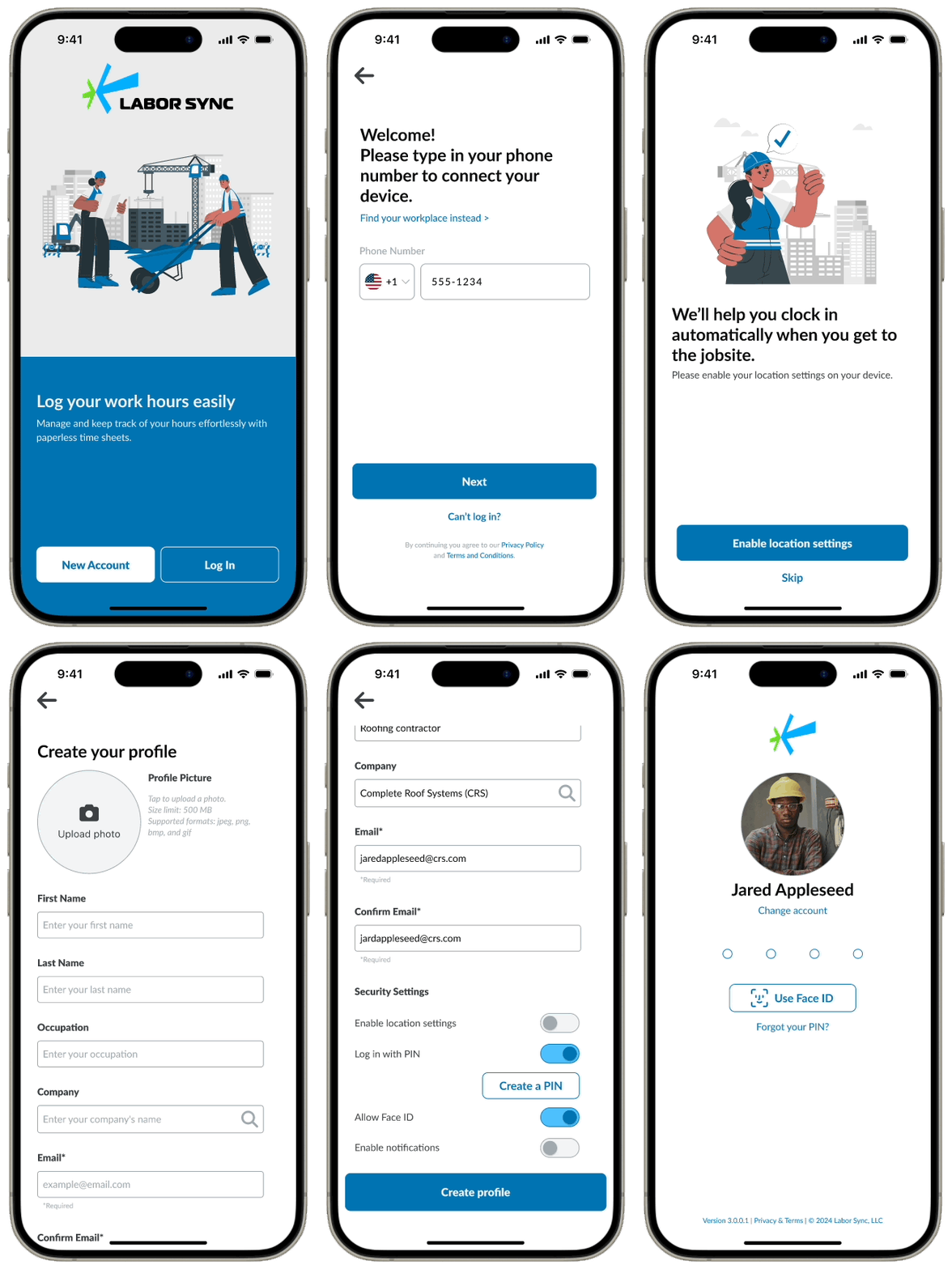
Improved Onboarding
Gives control back to the worker
New access to customization options
Clear, easy-to-follow steps
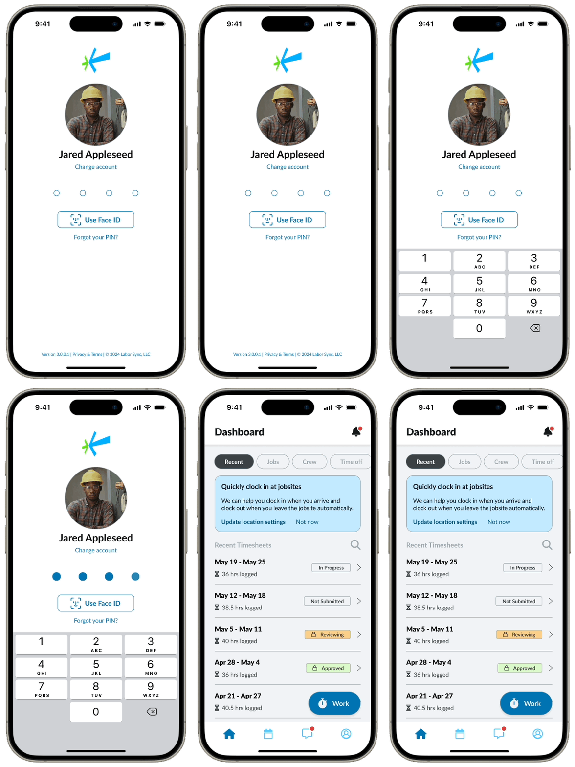
Improved Login
Login method (4 digit pin & Face ID)
New ability to change accounts if multiple workers share one device
PIN reset if you forget
New animation to confirm if your login is correct
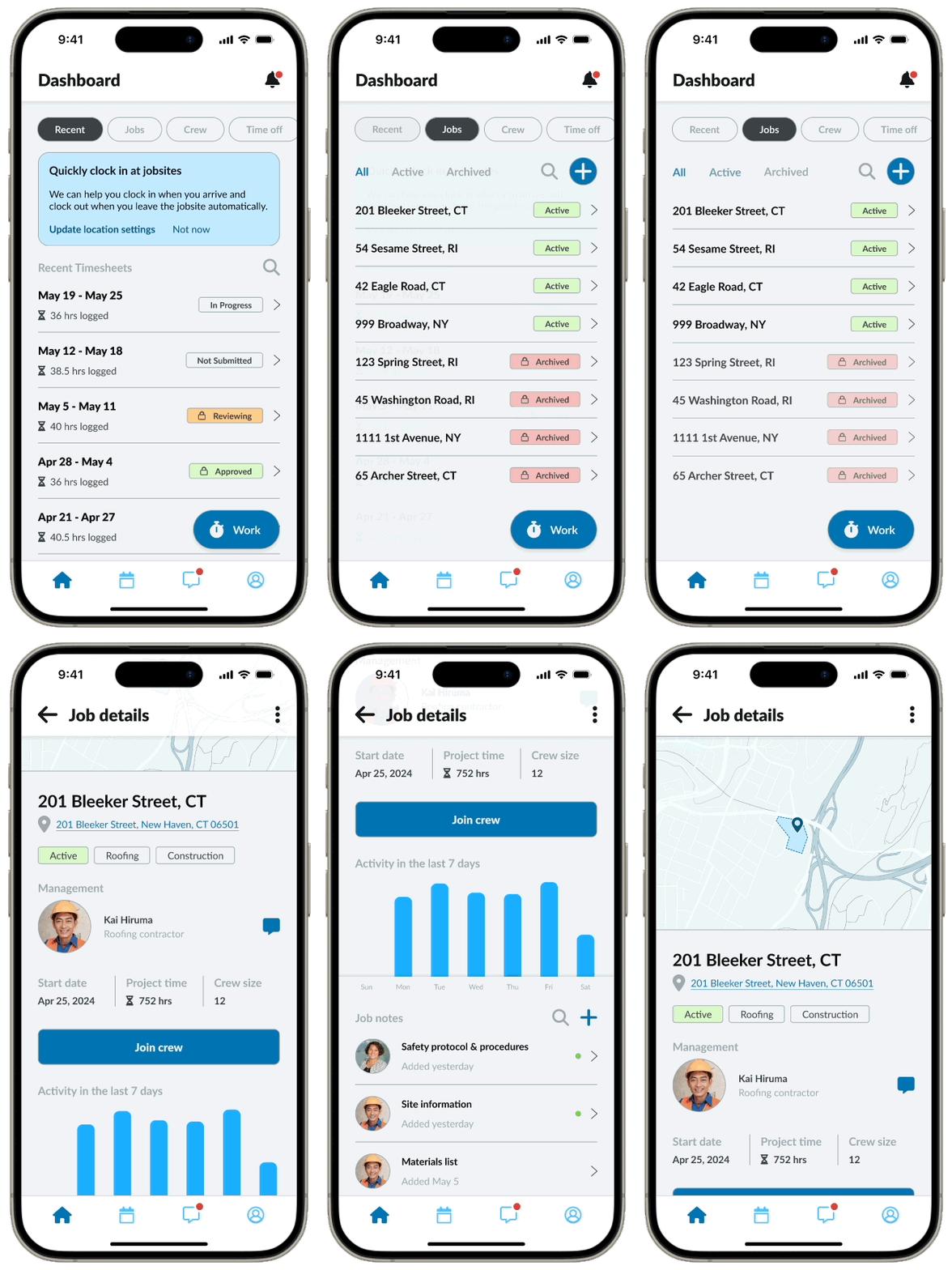
Dashboard & Timesheets
Studies showed that workers wanted more visibility into their timesheets
A dashboard overview was created to immediately display their recent timesheets, job details, crew details, etc.
Workers are able to review and submit their completed timesheets for payroll from the detailed view
Charts help visualize the accrued time and clearly displays any adjusted times
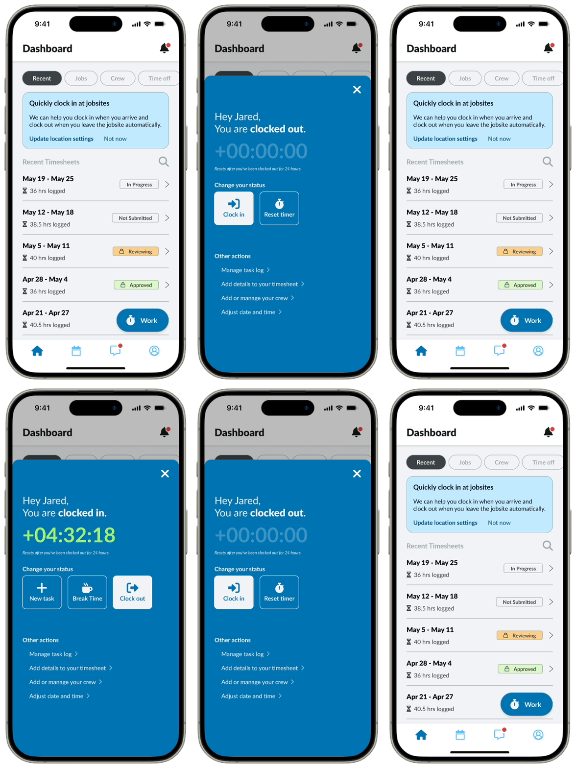
Quick action - Work
The timecard is accessible at any point on the dashboard, indicated by the “Work” button
Colors are kept consistent with the theme of the app, and strategically uses color on the time to indicate their current status: clocked in, paused, or clocked out
Icons help to differentiate what each button does
Workers can access other options to manage the details of their timecard, such as crew information, time allocation, etc.
Job details
Workers wanted more visibility into job details including location, project managers, and job notes.
Each job view displays the site fence on an interactive map that would automatically clock them in or out
Workers can directly message the project manager from the job detail view
Job notes that are new/unread are clearly marked for the workers
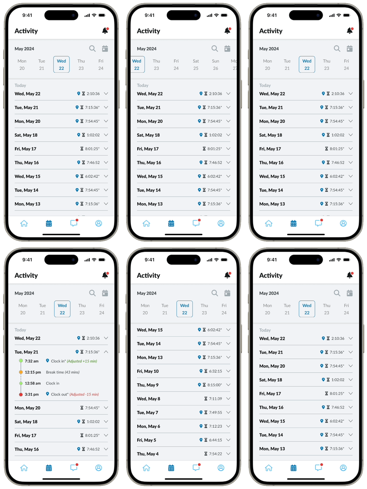
Activity Feed
Activity views for each day of logged work consistently resembles the format from the timesheets
Search for date & date ranges
“Today” button
Clearly mark which logged sessions were tracked with GPS/Geofencing
Workers were keen on knowing what adjustments were made
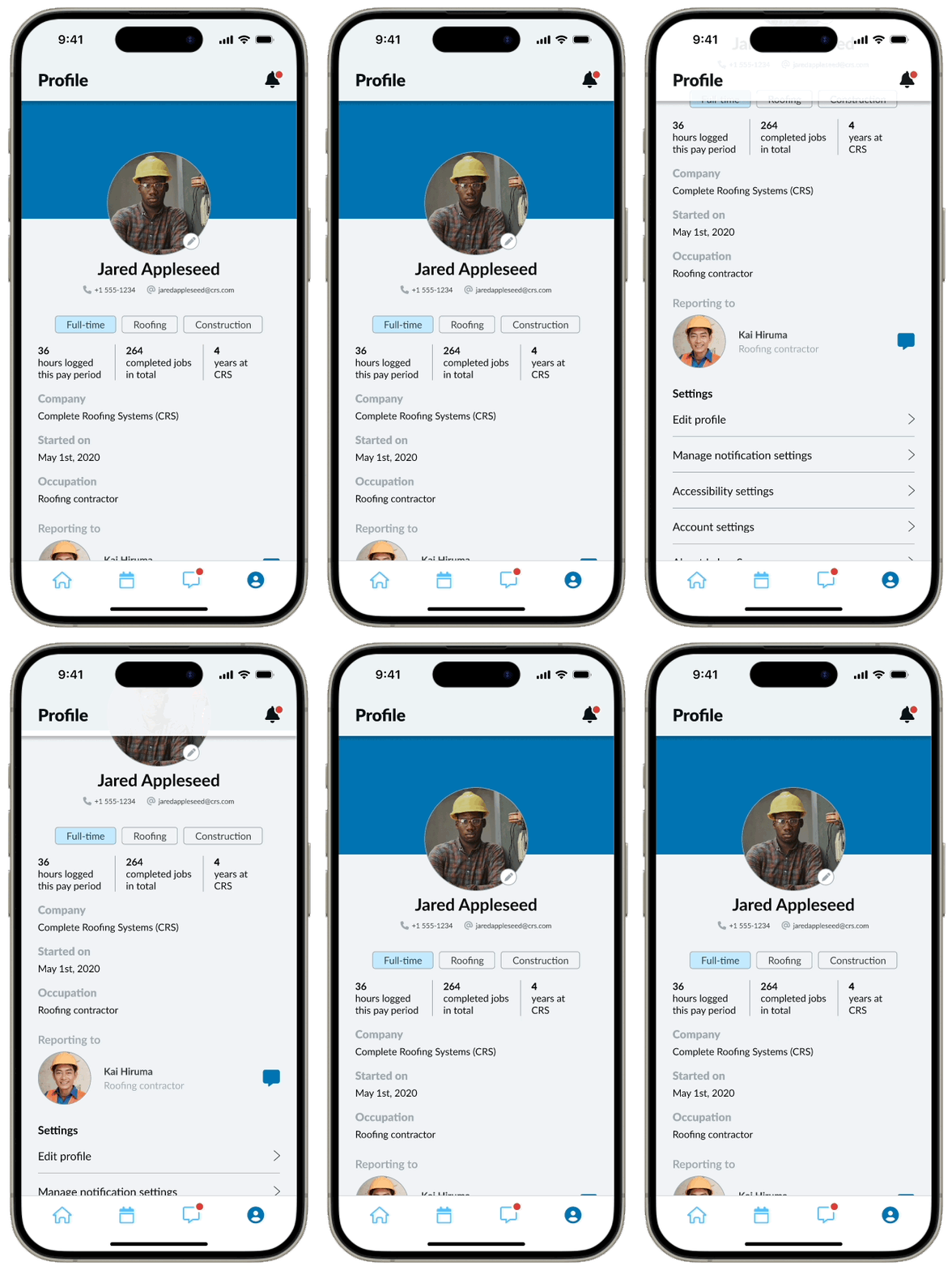
Profile page
Access to profile, device, and account settings
Quick stats to keep workers motivated throughout their week
Reflection & Learnings
Key learnings emphasized the balance between simplicity and functionality in user experience design. Continuous refinement based on user feedback and competitive analysis are top priorities in sustaining Labor Sync's market position and user satisfaction.
This project reinforced the importance of user-centered design and iterative testing. It also highlighted the value of effective communication and collaboration within a multidisciplinary team.
